
Slice Out Hunger
A national non-profit using pizza for good.
Disciplines
Strategy
Visual Identity
Brand Messaging
Design Collateral

A brand designed around playful yet sensitive communication.


Rounded. Versatile. Scalable.
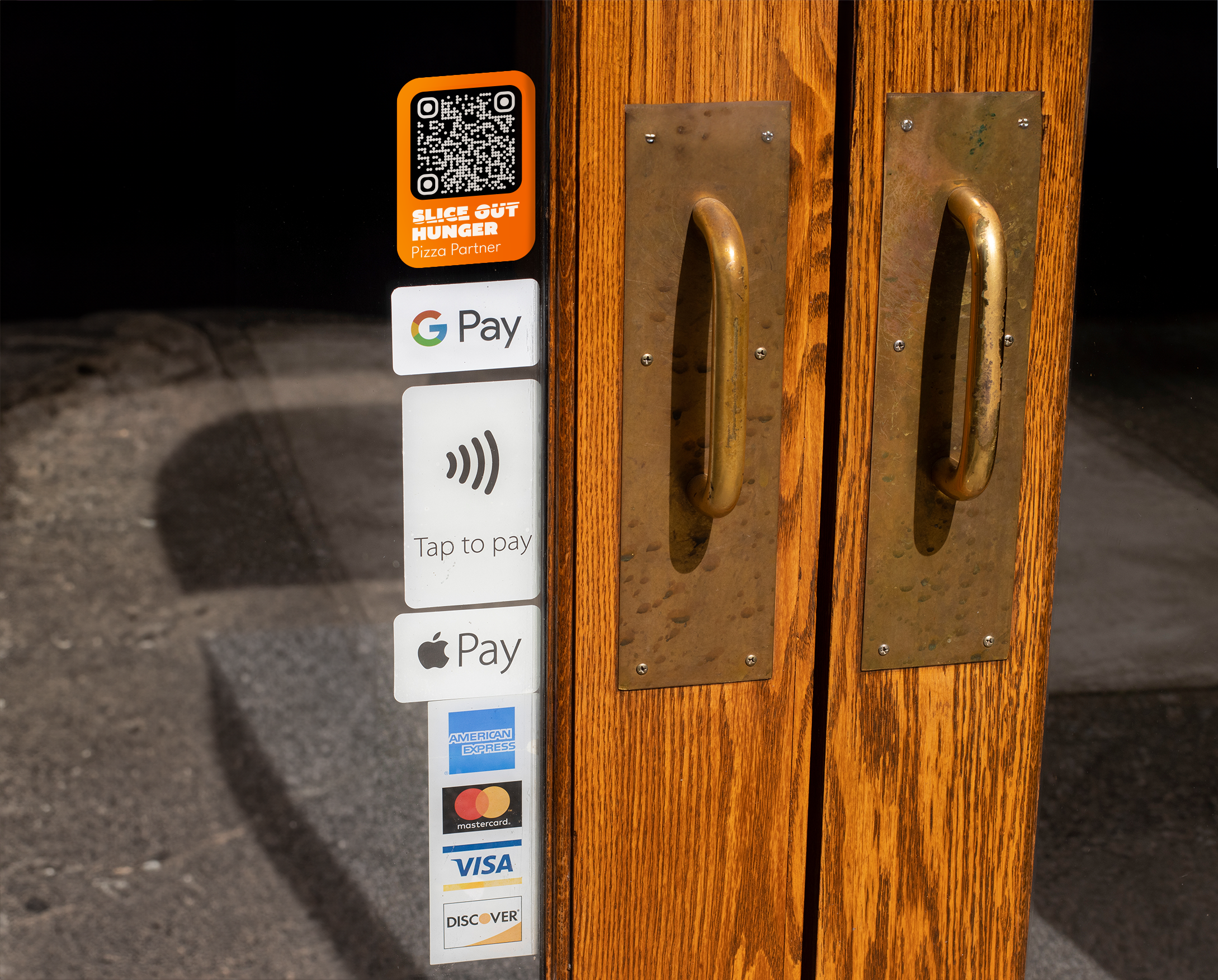
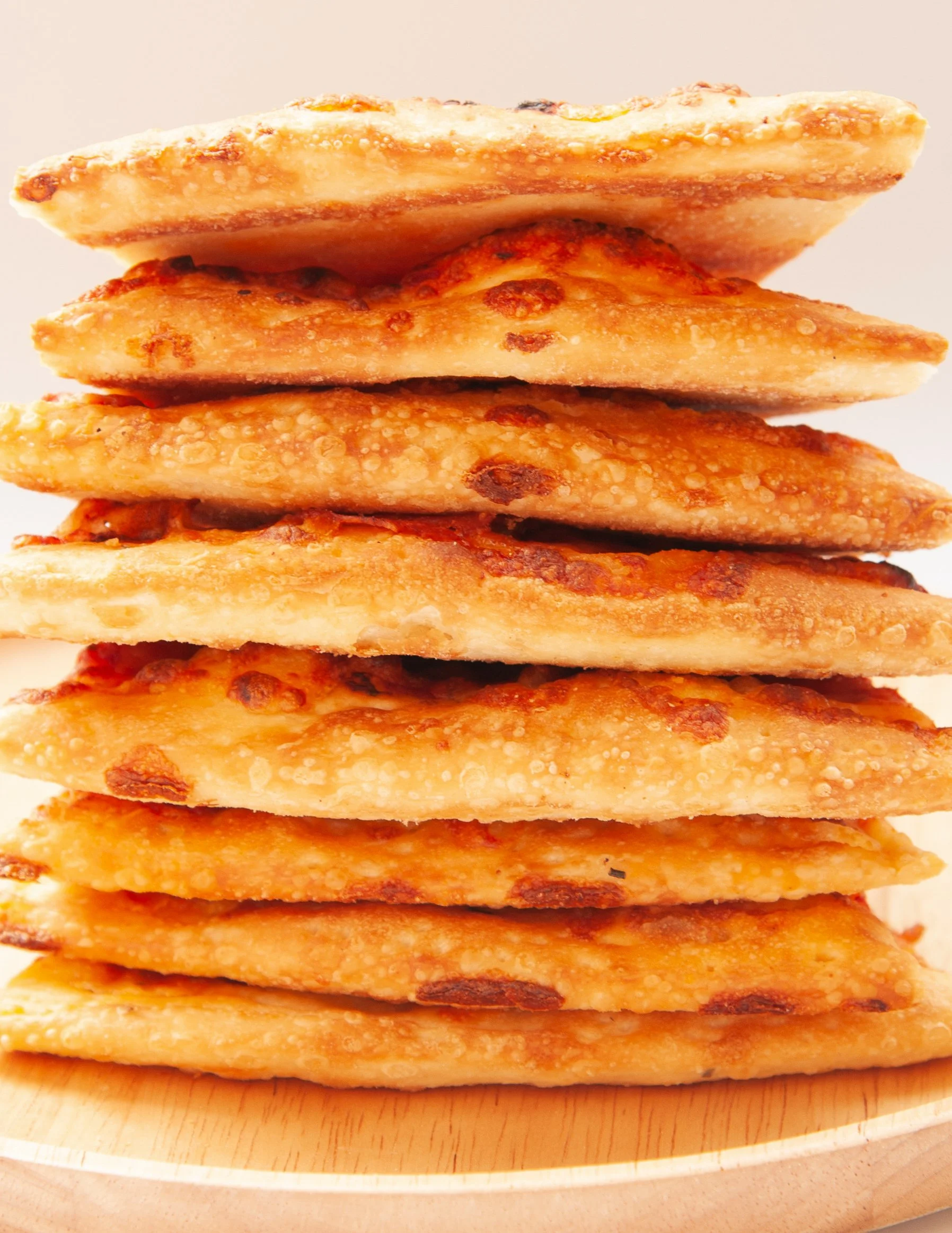
Pizza is at the core of Slice Out Hunger, and its campaigns.
The rounded shapes convey a sense of fun, openness and excitement allowing for easy integration into various materials, from social media posts, promotional material.

The Brand Family
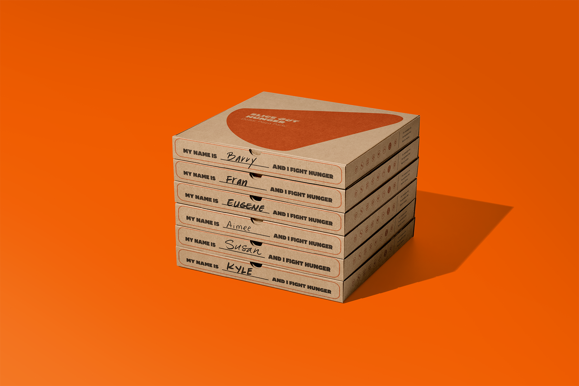
At the heart of Slice Out Hunger are eight annual pizza-centric campaigns. This ecosystem of workmarks and badges allows for clear and understood messaging across all marketing material.
Dollar Pizza Party
Pizza on the Pier
Las Vegas Pizza Tailgate
Pizza Relief

Pizza Across America
Summer Slice-a-thon
Season of Giving
Pie it Forward


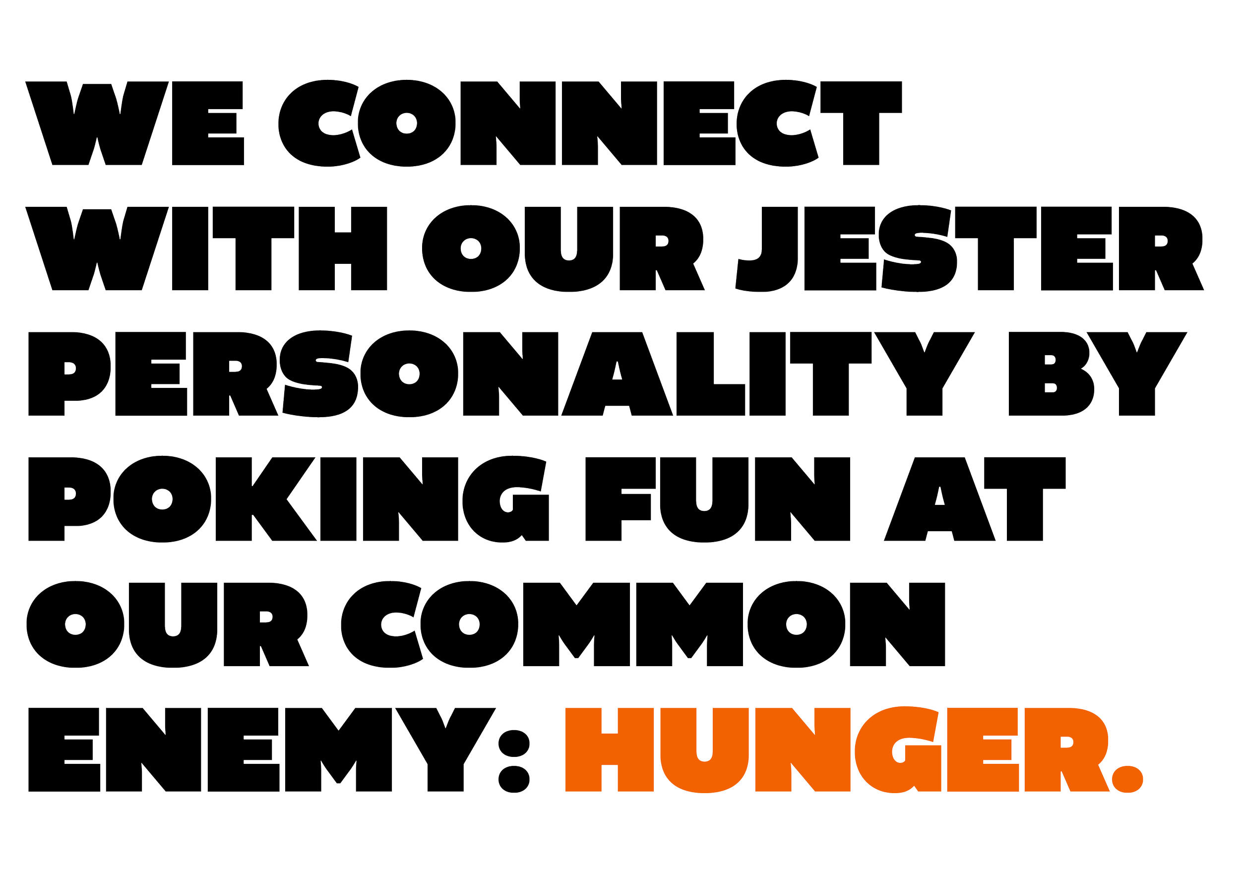
Bold type is vital to how Slice Out Hunger communicates.
Ideal for a non-profit brand that embodies playfulness, fun, and the spread of happiness— these two types blends a clean, modern aesthetic with a touch of whimsy, creating an approachable and lively visual language. Its rounded, friendly letterforms evoke warmth, and playful wit.


Brand GUidelines
See the guidelines website we designed for Slice Out Hungers external stakeholders.
